byministry
Overview
Food, Culture & Lifestyle Platform. Designing a bold editorial-commerce experience that brings together culinary content, events, products, and culture through an expressive digital system.
Client
byministry
Role
UI/UX, Interaction & Motion Designer
Impact
Created a distinctive digital identity that connected editorial storytelling, recipes, events, and commerce within one cohesive responsive experience.
Global Footprint
Toronto, Canada
Turning a Lifestyle Brand into a Distinctive Digital World. The experience was designed to feel more like an editorial publication than a conventional e-commerce site, using oversized typography, bold composition, and unexpected transitions to create a strong and recognizable brand presence.
Editorial Art Direction
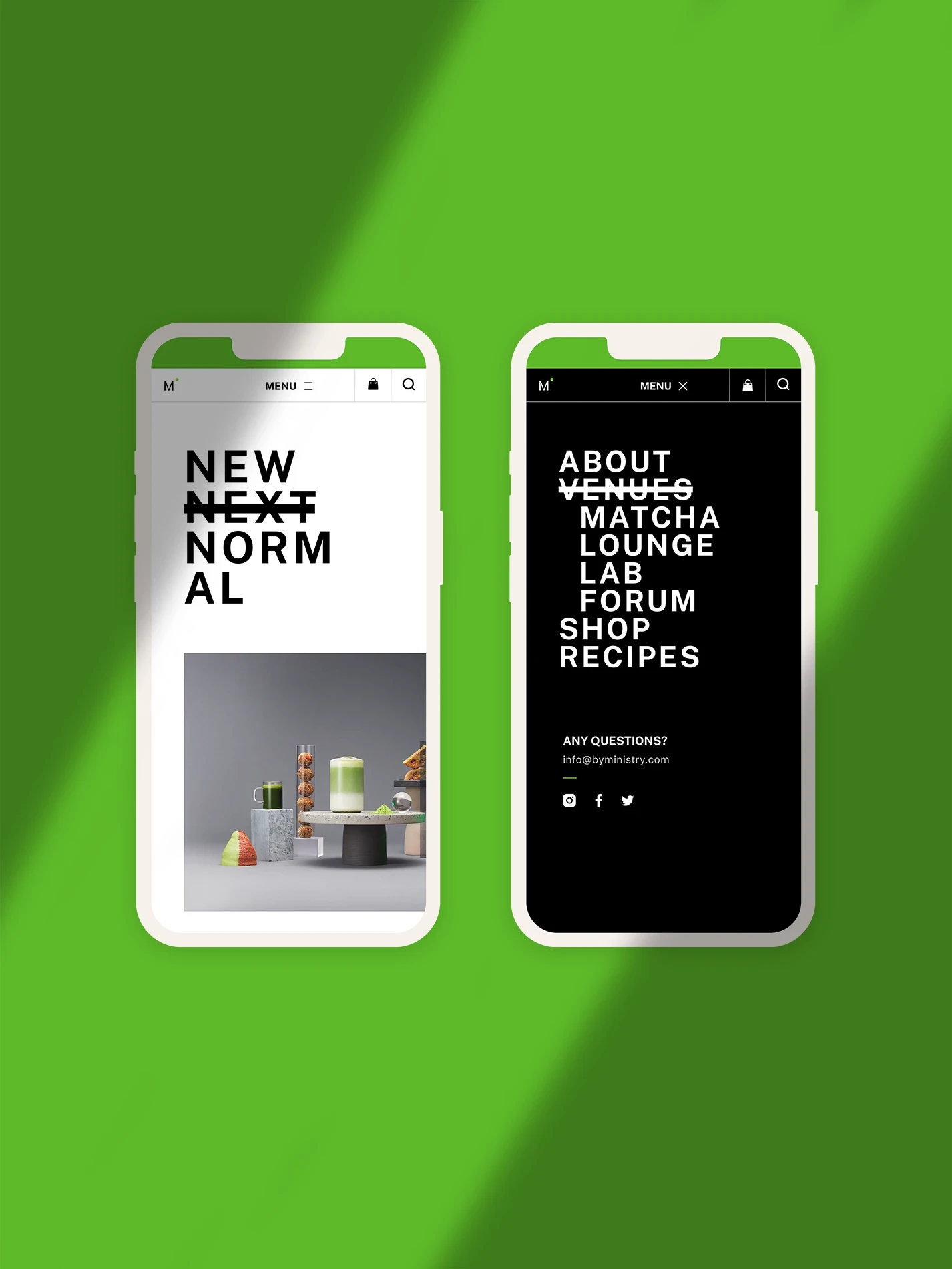
Large-scale typography, asymmetrical layouts, and minimal colour cues established a confident visual language across the platform.
Unified Brand System
Content, products, recipes, and events were brought together through one consistent design framework.
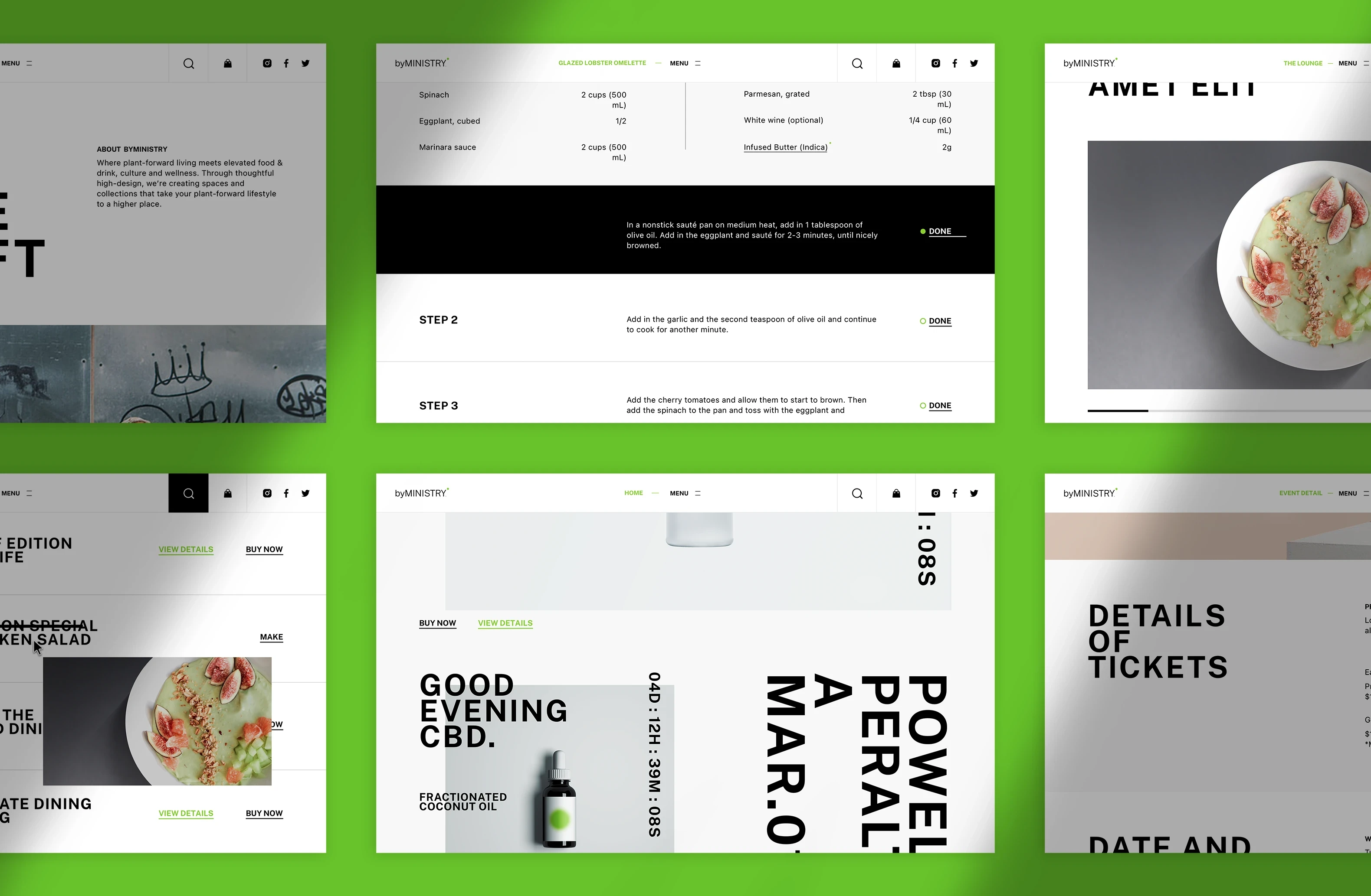
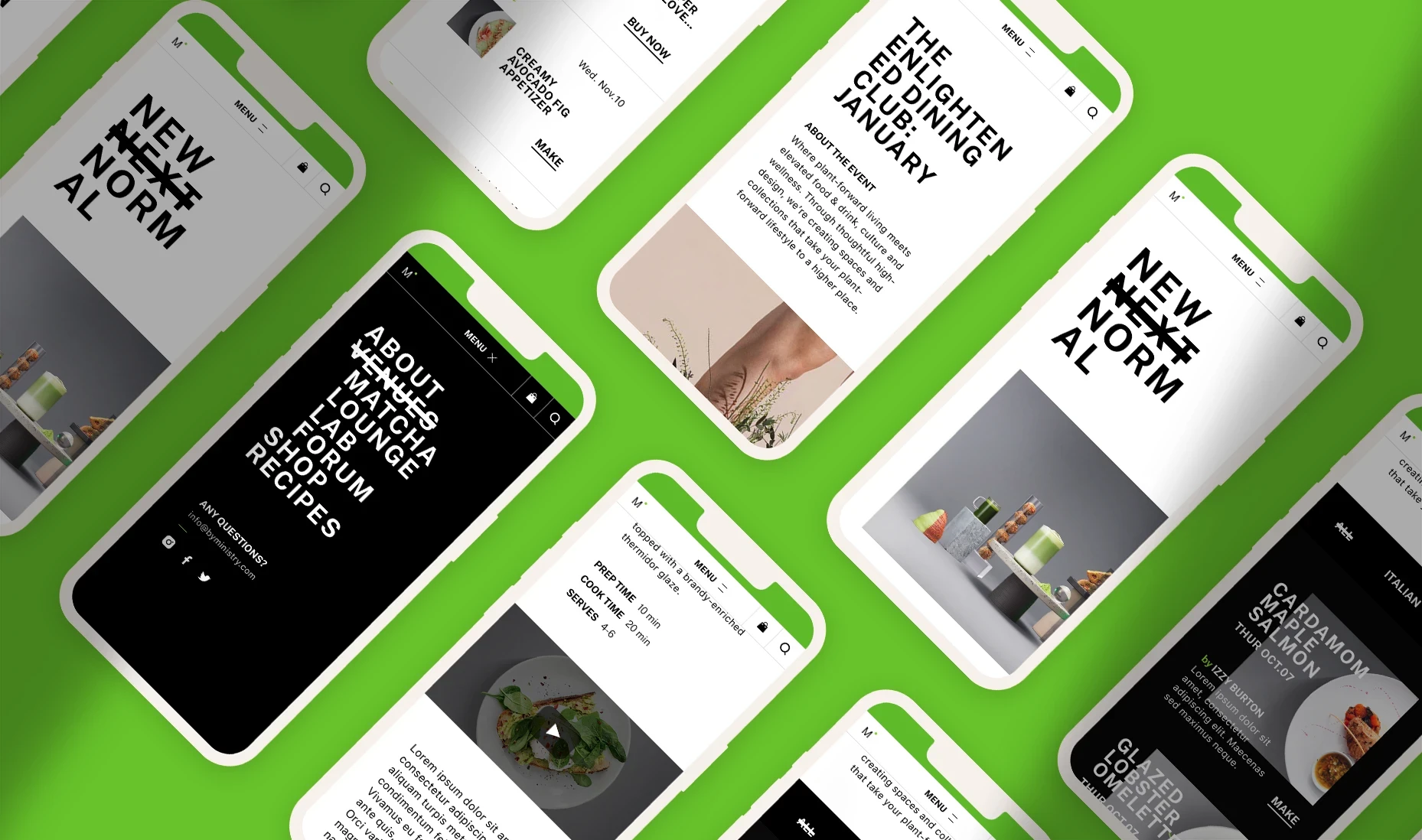

Connecting Inspiration, Discovery and Purchase in One Flow. Instead of separating editorial content from commerce, the platform allows users to move naturally between recipes, products, events, and brand stories, creating a more connected discovery experience.
Recipe-Driven Storytelling
Step-by-step recipes combine editorial imagery, ingredient details, preparation guidance, and supporting video content.
Integrated Commerce
Products and calls-to-action are embedded directly into the browsing experience without interrupting the editorial flow.
Using Motion to Create a More Sensory Digital Experience. Scroll-based distortion, layered colour-channel effects, and graphic transitions were introduced to give the interface a more expressive and immersive character while keeping navigation clear and usable.
Scroll-Reactive Visual Effects
RGB separation and image distortion respond to scrolling, adding movement and visual tension throughout the experience.
Responsive Interaction System
The same visual language was adapted across desktop and mobile, preserving the personality of the experience across screen sizes.
More works