Arts&Letters
Overview
An Editorial Digital Home for a Creative Agency. Designing a refined portfolio website for Arts & Letters Creative Co. that gives the agency’s work, people, and point of view room to breathe. The experience uses restrained typography, generous whitespace, and image-led layouts to create a digital presence that feels closer to an editorial publication than a conventional agency site.
Client
Arts & Letters
Role
UI/UX & Interaction Designer
Impact
Created a flexible portfolio system that presents a wide range of creative work through one consistent, editorial visual language.
Global Footprint
Richmond, Virginia
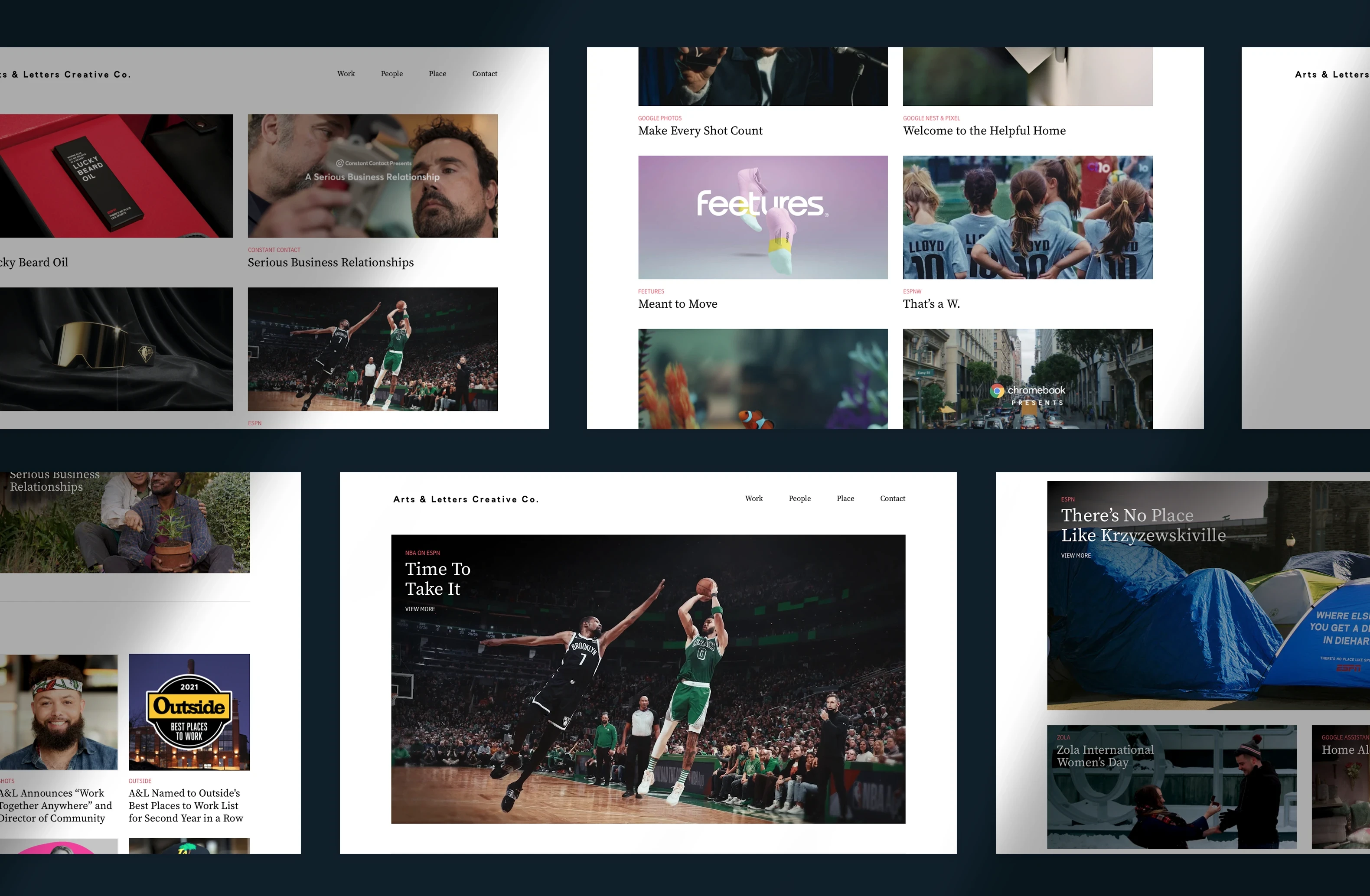
Letting the Work Lead the Experience. The site was designed to keep the agency’s projects at the center. Large imagery, minimal interface elements, and a clear editorial hierarchy allow visitors to scan, pause, and move between campaigns without unnecessary visual noise.
Image-Led Layouts
Uses generous image scale and spacing to give each project a strong visual presence.
Clear Editorial Hierarchy
Balances client labels, project titles, and imagery so users can understand each story at a glance.
One Structure, Many Types of Creative Work. Arts & Letters works across very different clients, formats, and campaign styles. The site needed a system flexible enough to accommodate video, photography, campaign imagery, editorial stories, and agency news while still feeling cohesive.
Modular Project Grid
Supports different content types and image ratios without forcing every project into the same visual treatment.
Consistent Brand Rhythm
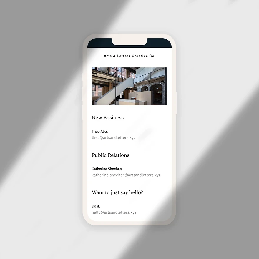
Maintains a recognizable typographic and spacing system across work, people, place, and contact pages.
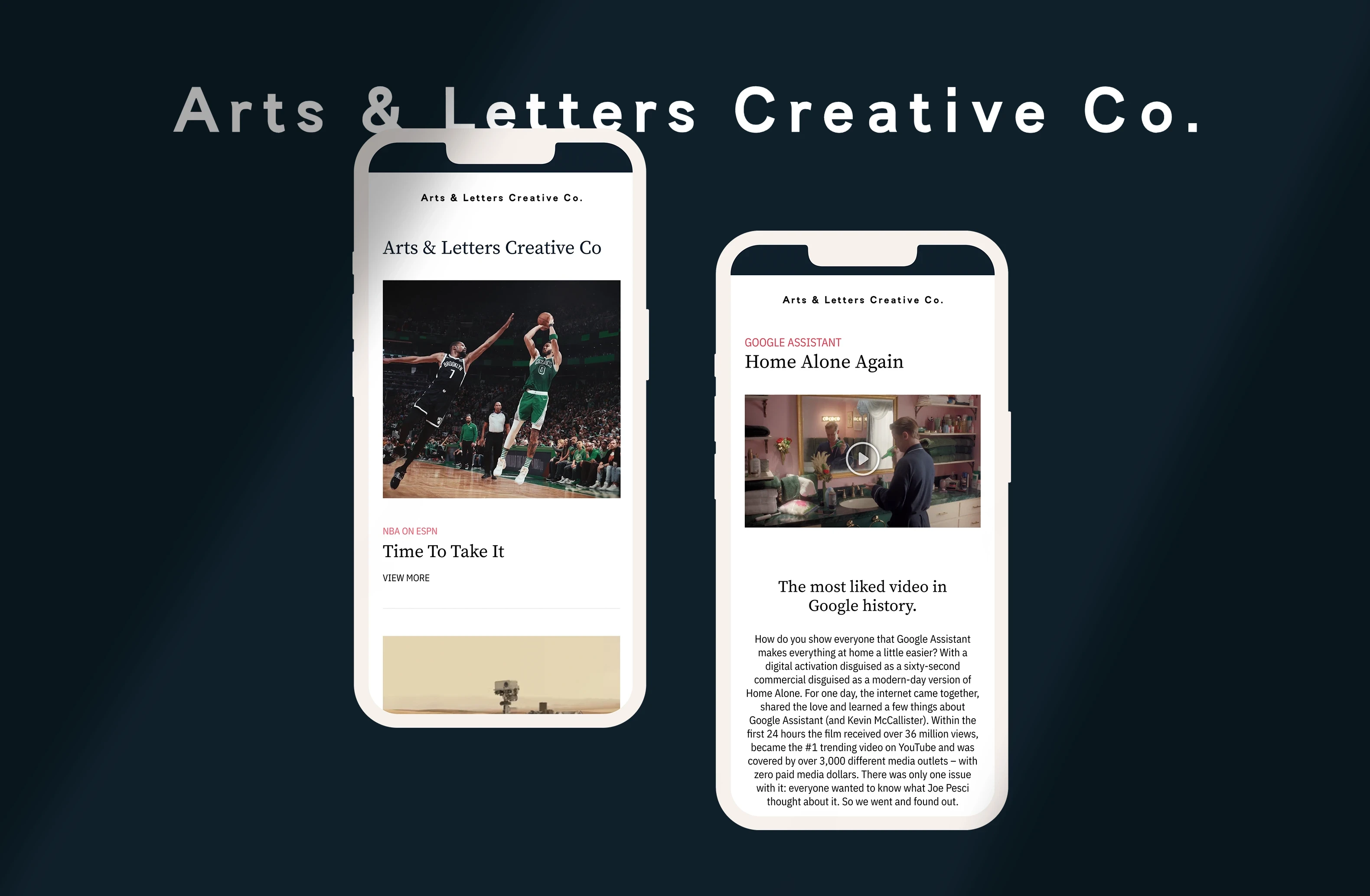
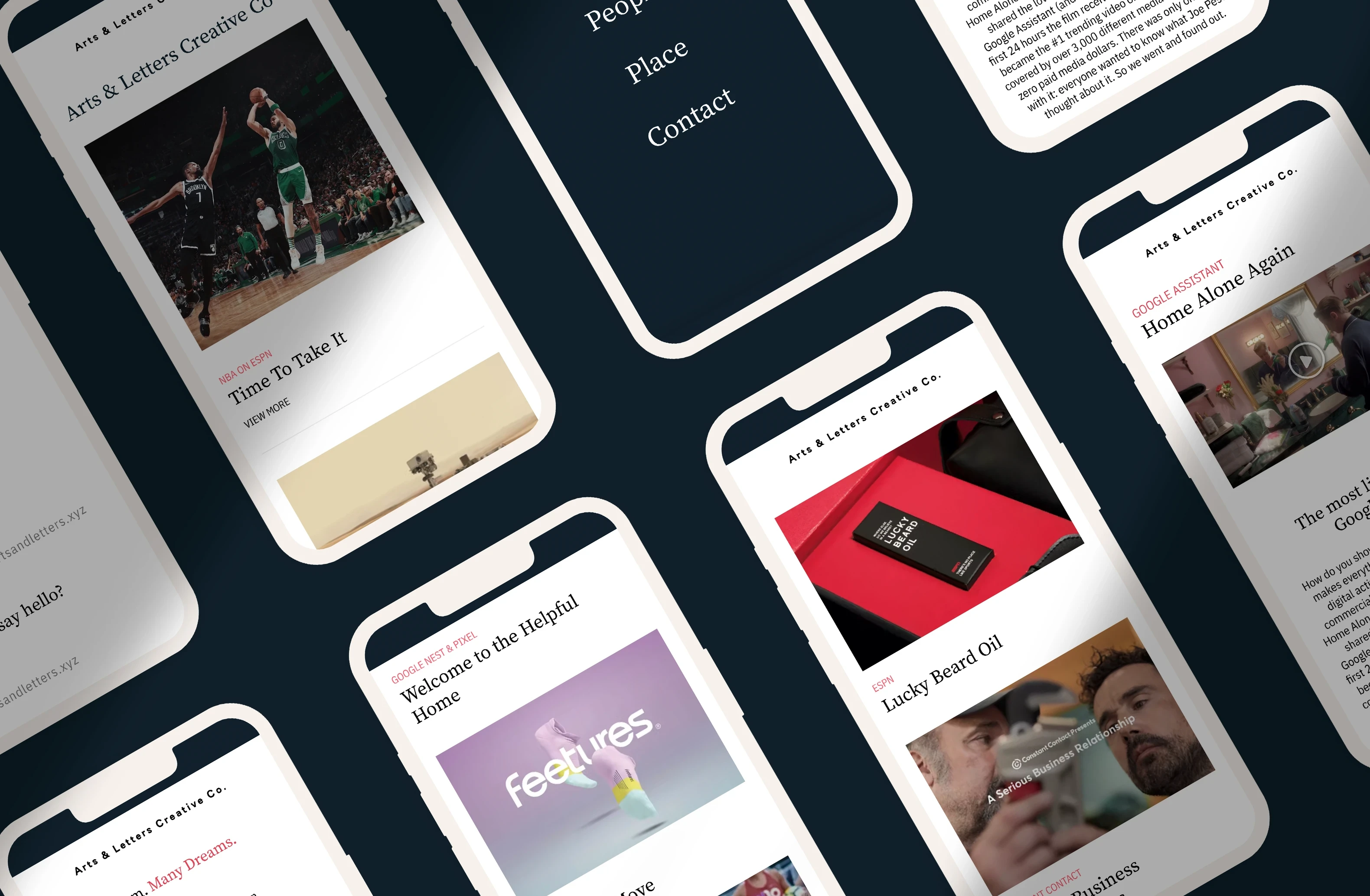
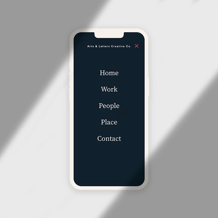
Translating Editorial Restraint Across Every Screen. The desktop experience uses open grid compositions and generous whitespace, while mobile simplifies the same system into a focused single-column flow. Navigation remains minimal and direct, helping the experience feel calm and intentional at every size.
Mobile-First Clarity
Reorganizes project content into a clean vertical feed without losing hierarchy or visual character.
Minimal Navigation
Uses a simple full-screen menu and focused page structure to keep attention on the agency’s work.
More works